How to Draw Your First Pin-Up, Part 1: Inspiration and Rough Sketching!

The purpose of the Lazy Pencil is to help a whole new generation of beginning artists make new, fun, original pin-up art and have FUN doing it! (Because I’m in that same boat, just maybe a year further along than you, and this is all the stuff I WISH someone had told ME, starting out!)
Below is just an OVERVIEW of the steps I take to make pin-ups, follow along the best you can, and I might expand each idea below into a whole post, if there's enough interest!
And remember this is for BEGINNERS- never worry if you’re not ‘good enough’ to start drawing fun sexy pin-ups of your own creation- you’ll never be a Polished Expert if you don’t start off as a Rough Beginner!
I’ve only been doing this about a year, and even in that time I’m, like, FIVE TIMES better than I used to be- think about where YOU could be in a year, if you just start NOW!
Okay, let’s begin with-
STEP 1: Inspiration
This is by far the hardest step.
A great concept can carry a bad drawing much further than great linework can carry a boring concept. And a great concept is FUN. Who wants to look at a beautifully rendered piece of art that leaves you feeling empty or worse, indifferent, afterwards? So a great Pin-Up Concept needs to do THREE things:
Be SEXY (whatever that means to you)
Contain IRONY (we expected A but got B!)
Be more SUGGESTIVE than EXPLICIT
On the last point, there definitely is a time and place for explicit nudes- museums are filled with them- but to specifically be “Pin-Up Art” like we’re shooting for, it’s probably more fun to have a woman’s (or guy’s!) bits be playfully covered by a silk sheet or semi-transparent feathers than to be out there in the wind.
We’re aiming for an image pinned up on your bedroom or kitchen wall that makes a wide range of people LAUGH, not feel icky. Tastes vary, but that’s my advice. (And you will definitely practice nudes on the way to getting better at anatomy- that is required actually- but just try to imagine the person pinning your work up in a public garage or military baracks where it’s meant to be seen- what do THEY want people to think about them?)
I start by looking for good poses, typically on reddit. r/siswimsuitgirls is good for Sports Illustrated bikini models, who are always posed and lit and shot very well. You can also look at r/playboy if you cover your eyes somewhat or even old Betty Page shots, which always have good energy. Today’s inspiration comes from Pinterest, where I found this image:

The copy I found was from Pinterest user “Topher” but it’s obviously a Jessica Rabbit variation and I’ve seen it other places, so who knows who made the original. (If it was you, let me know and I’ll edit this to credit you!)
Specifically, I was inspired by the leftmost picture- that woman is GOING somewhere, she’s well dressed and ALLURING, and SOMETHING is going on to her right, which is always good for storytelling and composition.
So I made a few quick pencil sketches in my own style (don’t worry, I’ll tell you exactly how to do that in section 2), and came up with this:

So at this point I’m relatively sure I can decently recreate the pose (I will tell you how in section 2 below), but we’re still looking for the IRONY of the concept.
Everyone knows what ingredient #1 SEXY is, but what is ingredient #2 IRONY?
A good pin-up needs a STORY. There has to be something happening BEFORE and AFTER the moment captured in the image, and that thing has to be FUNNY and SURPRISING. The audience (and sometimes the character) has to expect X to happen, but OOPS!, we got Y, it’s total opposite! Here are some quick “expect X but get Y” ideas off the top of my head as examples:
A law-abiding cop is trying to arrest a bold cat burglar, but OOPS- they fall in love!
A stud football player expects to take out the head cheerleader but OOPS- she’s fallen in love with another girl on the cheerleading team instead! (I guess I do a lot with love)
A sexy housewife (or househusband) is trying to do some backyard gardening in a scanty outfit in peace but OOPS- the neighbors keep peeking over the fence to disturb them!
You can probably picture a finished pin-up for each of those bullets in your head, and that’s when you know you’ve got a good story.
If you need examples of “single pictures that tell a story”, we should look at the greatest pin-up artist of all time, Norman Rockwell. (Yes, I’m kidding, but only partially.)
For those who don’t know, Norman Rockwell was an artist in the 1940s or so who did very wholesome “Americana”-type magazine covers that were nostalgic, idyllic, and very intricately drawn. He never did sexy work, it was always wholesome, but each image still told an entire story, like this:
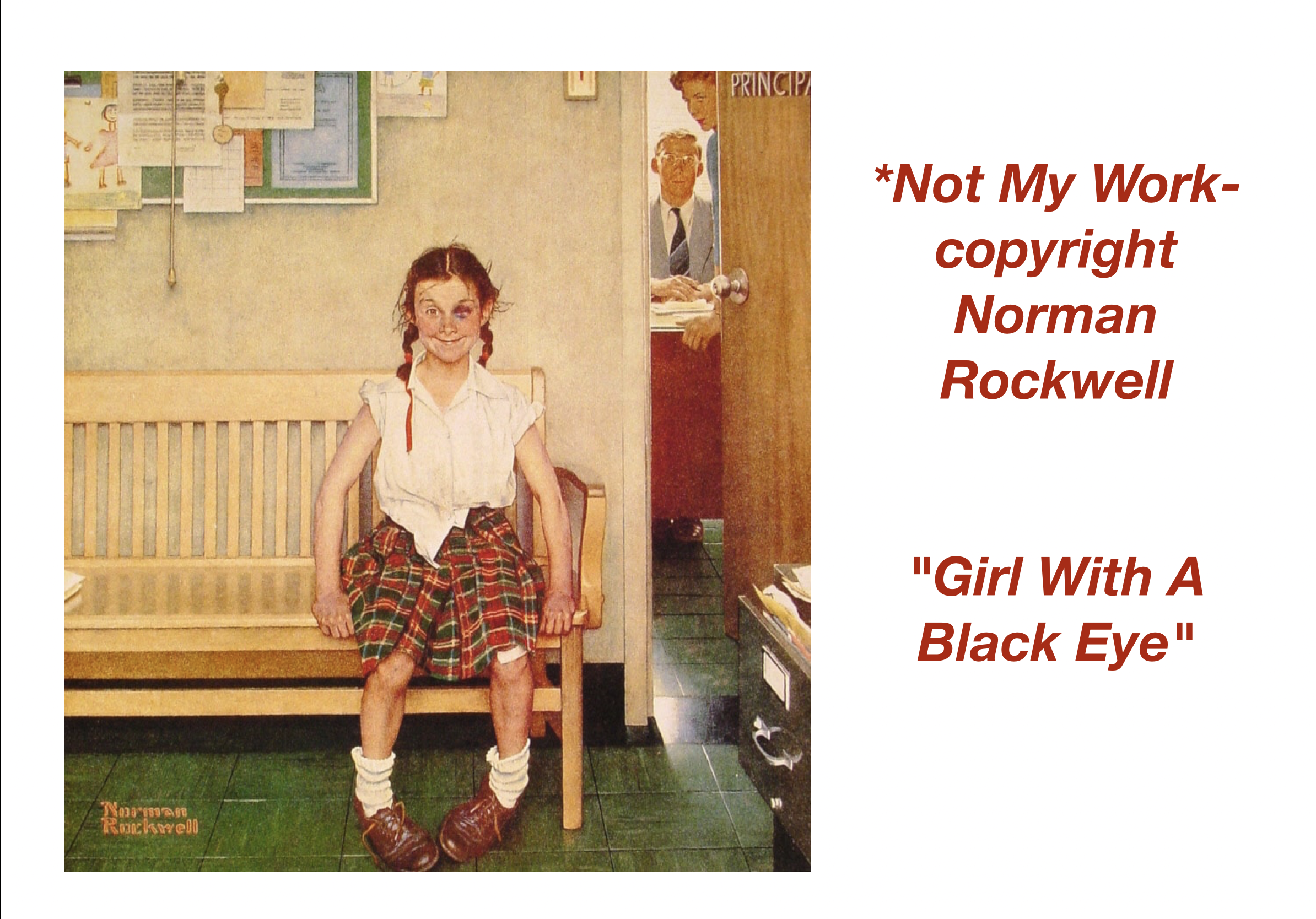
What happened BEFORE this snapshot in time was taken? The girl got in a fight.
What’s going to happen AFTER we stop looking at this image? She’s going to get chewed out by the principal.
But how does she FEEL about that? That’s the Irony- she WON that fight and she’s LOVING it, that’s what makes this cute and wholesome and not sad.
Here’s one closer to our genre:

What’s the IRONY there? You can tell by the title: the big strong football hero is afraid of the small needle the cheerleader is using to sew on his letter! (That’s how I read it anyway, he could also have a crush on her. There’s that love angle again…)
So that’s the type of Before/After/Story/Irony we’re going for, but for an adult audience. Coming up with a few ironic situations of your own yet? Let’s look back at my pencil sketch:

She’s obviously walking away from something-
But looking back towards it with a satisfied smirk-
She’s probably causing a scene, from how she’s dressed-
So after a lot of brainstorming, the phrase that came to my mind is:
“Make A Scene, Just By Being Seen.”
And just a quick check to see if that phrase has ever been used before…

Holy crap, it HASN’T? Okay, I guess it’s ours now!
And for a lot of the sassy ‘retro’ magnets you see in tourist shops, this might be enough- a hot woman and a catchy phrase put together is probably enough to sell a sassy magnet:

I might even sell stickers of just that, depending on how good the final art of this piece comes out- check my store later to see if I followed up on this off-hand promise or totally forgot!
But to be like Normal Rockwell, we can do better than just text.
A lot of old pin-ups put the woman in a position where “OOPS, my clothes fell off!”, which is distasteful to modern values. I mean, there’s a great 1950s artist named Art Frahm who did SO many examples like this:

As well drawn as that art is, that’s just silly. And puts the woman in a REAL strange position to our modern eyes, where we’d like a little more consent. Here’s another example of 1950s panties falling down for some bizarre reason:

Here’s a great article about this epidemic of 1950s pin-up panties falling down that made me laugh: https://www.trollbreath.com/2021/08/15/the-effect-of-celery-on-mid-century-elastics/
But the point is, we can do better.
While many old pin-ups put the women in exploited situations, many modern ‘pin-ups’ are just “Hot woman stands next to thing”. This happens a lot with ‘biker’ or ‘Route 66’ pin-ups I’ve seen- “Hot woman stands next to thing” but doesn’t affect it. She was probably photographed in a New York studio hundreds of miles away from the car or motorcycle or desert she’s supposedly standing next to.
We can do better. The parts of the drawing should interact. And be intimately tied together.
It’s a common trope for hot women to cause car accidents just walking by, and I thought about that here but rejected it as too overdone. But while doodling in my sketchbook a few iterations down the line (and then recreated digitally for you to see), I came up with this, which instantly made me laugh:

Not only is the woman empowered, unlike our 1950s panty-challenged pin-ups, she’s actually AFFECTING the scene behind her, unlike our modern Route 66 pin-ups, and unlike a simple car crash-
-what do we EXPECT this woman to actually DO about these two trains on the same track?!
From the blocking and composition of the scene and her smirk and the train conductor’s open mouths, it’s obvious I’m implying she CAUSED the accident, but really, HOW THE HELL IS IT HER FAULT that two trains were on the SAME TRACK SOMEHOW? That’s what made me laugh, hopefully it does for you too.
And yes, I did make those trains just a LITTLE BIT penis shaped to make it funnier for me. Especially the “spurting” steam exhausts, which I’ll flesh out in later iterations.
And yes, this type of train crash actually DID happen once, not because of a distracting woman, but because a bunch of men wanted to sell tickets to it:

There’s a fun article about that on purpose train crash here: https://factschology.com/factschology-articles-podcast/train-crash-crush-texas and yes, that’s the reference image I used to sketch the trains.
But at this point, I’m relatively sure I’ve got a pin-up concept which will work and is worth putting time into finishing. Because if it’s not FUN, why would we draw it?
So how did we GO from my rough pencil sketches to that better digital version I have above? Well, for that, we need:
STEP 2: A Rough Blocking Sketch
The point of the blocking sketch is to get the energy and basic proportions of the pose correct (what some call “The Gesture”). Energy is most important at this stage for pin-ups, and fine details can come later.
As a Gen X’er, I always start my rough sketches with pencil and paper because that seems ‘more free’, then ink the good parts and transfer into my digital drawing tool, (Procreate for iPad) when things get serious. If you’re younger, you could start right in digital, if you wish.
And keep in mind you can do multiple variations to try concepts out, here’s three I made for just this drawing, you can see the evolution in action:

The first version copied our Jessica Rabbit reference pretty faithfully, down to the dress and the straight downward hair. In the second I wanted to push the curves for a more busty look, but rejected that because it made her look too silly.
But for some reason I put long windblown hair in the second one, and that DID make it into the final version. Recently, I’m tending to make my art hair crazy long and unrealistic because I always feel pin-up hair should convey an emotion, and if you can’t put a little fantasy into your art, what’s the point?
But the message is, to try things multiple times at this stage, do variations, and don’t get caught up on your first version. The day I made that last version, I was sitting outside in the warm sun, sipping a sweet hot coffee, and penciled it into my sketchbook while listening to a fun Youtube video, and immediately looked at it went “Yep, that’s the one!” Don’t stop until you get that feeling for yourself, it’s a good one!

And all those pleasurable add-ons, the sketching outdoors in the sun, the sweet coffee, the Youtube in the background, they’re sort of the point too. To last in this hobby, I feel you should try to make the PROCESS as pleasurable as the OUTCOME.
If you’re only happy when you FINISH a piece, you’ll only be happy 1% of the time, and then only for a few minutes. But during that hour of sketching outside, one of my neighbors walked by and said hello, I saw a cute rabbit run by really close, the coffee tasted great and I laughed a lot at the Youtube video (I think it was one of the great StrangeAeons’ videos dissecting weird Tumblr culture). It’s a core memory, even if this sketch goes nowhere. Which will ensure I keep trying, until the sketches do go somewhere.
If you make the process of practicing pleasurable, what ever that means to you, you’ll be happy most of the time you’re drawing pin-ups, and that’s the point.
But HOW did I make those sketches? Simple: for Pin-up Art, always start with the crotch.

Besides it being a little funny to me to always start every one of my drawings with the crotch, the bottom of the crotch is also usually perfectly halfway between the top of the head and middle of ankles for most poses, making it a great starting landmark!
Many better artists than me recommend using a “Granny Panties” or a “Bikini Shape” to rough out the shape of the crotch (you’re basically sketching out the width and height of the hip bones), so that’s what I do too, shown in red above. Using the Bikini Shape also lets you pin down which direction the model’s hips are pointing, which is good for energy and twist (‘contrapposto’, if you’re a long dead Italian Rennaissance painter!)
So, place the crotch, then choose an equal distance up and down (for a standing model), and those are roughly the top of her head and her ankles! If the model has pointed feet they will extend below your bottom line, if she is standing flat-footed they might not, but you have to judge that based on your art style. (My pin-ups always seem to be in high heels or standing on tiptoes with their feet pointed, to make their legs look longer.)
After that, split your lower half into two halves again, and there are your knees!

Then split the thighs in half and there is the size of your head! You drawing is basically done!

This last point is where things get a little fuzzy. Yes, technically, the thigh is about 2 heads long on most drawings, but where does a thigh BEGIN? I’ve been using that bony bump that sticks out where your thigh bone connects to your hip (called “The Greater Trochanter” if you’re being medical), which is a bit above the crotch line we’ve been using. Which is why the red heads don’t perfectly line up with the blue guides in the picture above.
And where does the thigh STOP? At the top of the knee? The bottom of the knee? The middle? This is why I didn’t put the “Equal Distance” text in the pic above, because it’s a little fuzzy. You’ll have to find what landmarks work best for you. You’re looking for simple formulas that you can remember, that don’t require any math, and are repeatable in ANY drawing. (I’m not great at math so I make mine as dumb as possible: “The thigh is two heads tall.”)
Being honest, since I’m doing pin-ups which usually feature a lot of leg, I place the thighs first, between the crotch and knees we’ve already placed, split that in half, and use THAT to size my head. I know a lot of artists size the head first, but for female pin-up sketches, I’ve found the crotch->head/ankles lines->knees->thighs->head sequence works best.
But how do you DRAW a sexy leg? At this stage we’re still doing simple but representative shapes, so I use what I call the “Pin Leg” and “Tube Knee” theories:


Did you ever hear 1930’s gangster types look at woman with long legs and exclaim “WOW that DAME’S got a great SET of PINS!”? This is probably where that came from. That’s my head cannon, anyway.
And knees are hella hard to draw anyway. Using ‘Tube Knee’ captures how the leg naturally slims down between the thigh muscle and calf muscle, it only works when the leg is straight, and I put the bottom of my kneecap at the BOTTOM of the tube knee. It’s very simplistic, but at this stage we’re looking for dead-simple and repeatable ideas to capture the energy of the pose, and “Pin Legs” and “Tube Knees” do that for me.
Look for them in your reference photos, and you can even see them in another finished piece I did (which IS up on my shop for sale, take that procrastination!):

After this I added a ball for the butt and a ball for the belly and a rib cage shape for the chest under a straight line for the shoulders, and now we’re really most of the way done with the rough sketch!
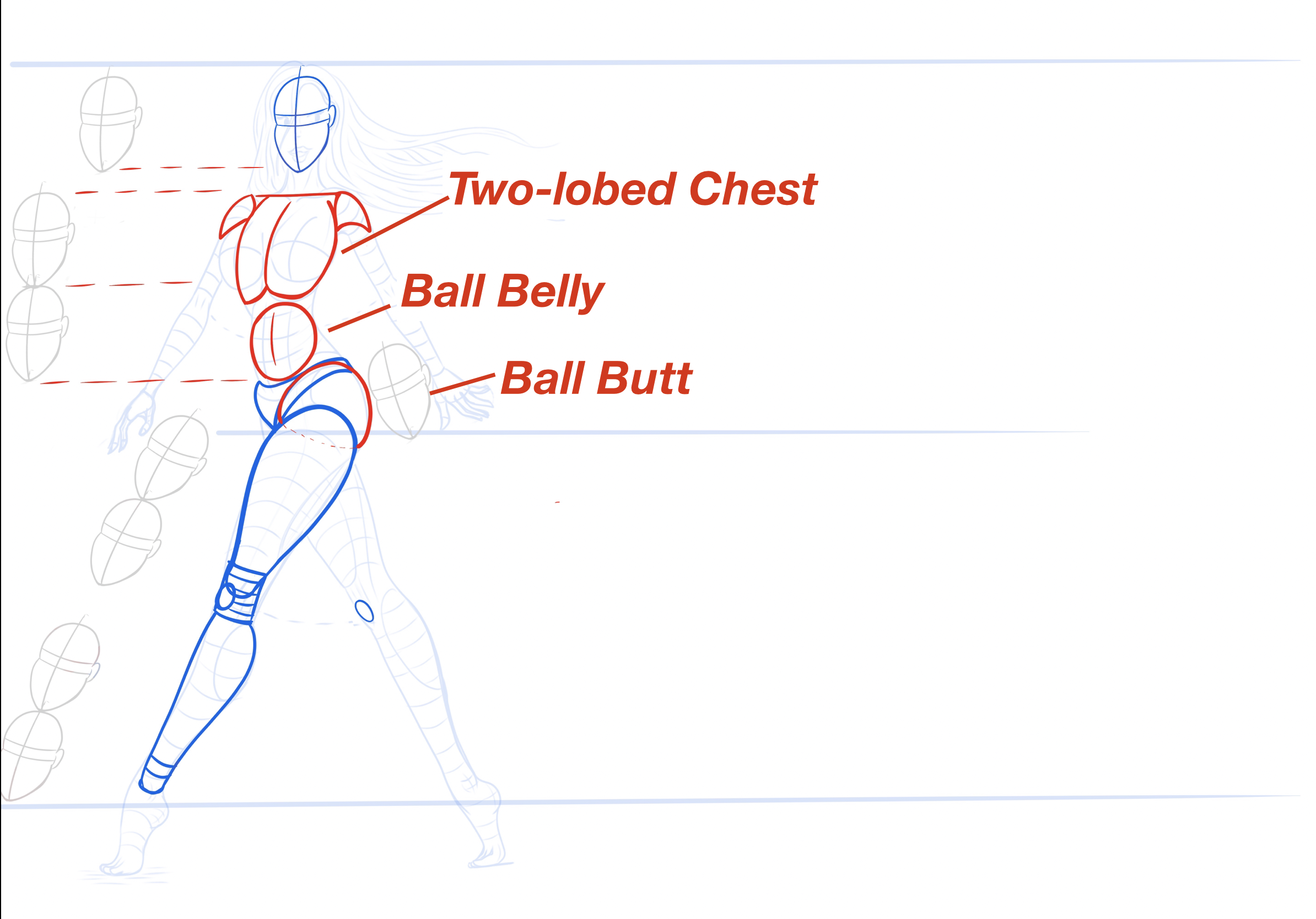
The butt on most pin-ups is a nice round ball ABOUT the size of a head as shown. (You’ll see this ‘about’ a lot, will explain in a sec.).
I used to draw the belly as a cylinder or some complex double-tube, but recently I’ve just been putting a ball there a little smaller than a head and I think that captures a natural soft curve of the abs better. And is a lot more repeatable!
As you see above, for the chest I DO add a little definition, because the direction and tilt of the chest matter, so you need that centerline. And the two lower curves on my chest shape (the bottom of the bottom ribs, if you stretch and feel them on your own body) are usually somewhat visible on most pin-up girls and guys, although you have to resist making that a SHARP edge, it’s more of a soft round, to be done during shading!!
Are you still following along on your own pin-up? If so, go to my “Contact” page and show me your work (if you wish) or let me know what I could have done to make this better for you up till now!
Now, let’s talk about PROPORTIONS.
There are a million art books on how to draw human proportions. Buy some. Proportions were the number one thing when I was starting out that made my drawings look '“wonky”.
Hands bigger than a woman’s entire skull, feet smaller than her hands, elbows way too low making her look like Slenderman or legs too short making her look like a Lord of the Rings Dwarf- I did them all at the start! Eventually you’ll memorize some common rules (the elbow hangs at the narrowest part of the waist, generally) and you’ll be fine. But you need the books to tell you the rules.
Here’s a drawing I made in June 2023 (so seven months ago now) to remember the rule that supermodels, superheros and impossibly good looking women are usually 8 and 1/2 heads tall, typically:

Oof- that face. Those twisted hands and deformed feet. I’m going to be showing you a LOT of my old bad embarassing drawings on this blog to motivate you. If I was THAT much worse just 7 months ago, think of how much faster YOU can make the same improvement!
But realizing things like most breasts hang one head distance below the line of the shoulders really helped me out, and I got that from a drawing book and then made the drawing above to refer back to and solidify it.
You can see that I was playing with the idea of Tube Knee even way back then, although I hadn’t figured out Ball Belly yet.
The 8 1/2 head rule is something every proportion book will teach you a variation of, but there’s one more important slider that NO book ever taught me, that I had to make my own name for, and that I WISH someone had taught me, starting out.
And that’s the “J Scott Campbell to Frank Cho Spectrum of Pin-Up Bodies”:

J. Scott Campbell is a legendary comic-book and pin-up artist known for doing very sexy Spider-Gwen and Mary Jane covers, and for the great “Danger Girl” comic book series that will forever be burned into my younger memories.
Frank Cho is an equally legendary comic book artist known for his funny, inventive, sexy pin-up covers and for his funny but heartfelt “Liberty Meadows” series, which I never got to read.
The great news is that BOTH these guys are still working now, so you can follow them on Instagram, buy their art books, and see them live at shows, which you can’t do for the majority of pin-up artists, who were mainly active in the 1930s-70s.
And although both J Scott Campbell and Frank Cho follow the 8 1/2 heads rule and all other human proportion rules, you can see that INSIDE that framework, they have vastly different styles and a good pin-up artist should CONSCIOUSLY CHOOSE where they fall on that spectrum. You can see it even when they draw the exact same character:

J Scott women are thin, almost ELFISH, angular, sexy, with arrow-sharp chins and TINY wrists and cinched waists and needle thin fingers. I see it mostly in the wrists, they’re so small and feminine but look like they could snap!
Frank Cho, on the other hand, draws more… rubenesque women, shall we say? Rounder chins, bigger muscles, bigger curves, bigger shoulders, thicker hips and legs, but still very attractive and feminine women! You can really see it in the first spectrum picture, that’s Brandy, his favorite character to draw from Liberty Meadows.
Now here’s what I wish someone had told me when I was first starting out:
If you use head to toe pictures of REAL models and actresses and swimsuit girls as your reference images to do your practice sketching on, there’s almost a GRAVOMETRIC PULL forcing your drawings to the J Scott side of this spectrum.
There’s only so much real estate on a screen and if you’re trying to get a full body in frame, even if you TRACE over a supermodel picture to start with, even a muscular one, her arms and legs and wrists will more like look like a thin J Scott Campbell elfish type than not.
I sketch on an iPad, and if you do too, try it. Put a standing, full body, head-to-toe reference image on the left of your screen and trace or sketch a copy on the right and see how thin her legs and wrists and ankles look.
At that camera distance and screen resolution, there is SO LITTLE space between a leg that has the desired sexy bowling pin shape and one that’s just a boring tube and that’s VERY hard to do right starting out. Sketching in J Scott Campbell style you have SO LITTLE error margin to make your line art perfect, I think it’s like sketching on hard mode.
HOWEVER, if you zoom IN on that reference model, maybe she’s now sitting cross-legged or with her knees to her chin to show her whole body but in less vertical space, and you give her more body mass, and something for her curves to squish against (a bra, a bench, her own arms), the sketching suddenly becomes A LOT MORE FORGIVING, because now you have many more pixels to capture the same subtle curve of her shoulder into her bicep or her knee into her calf than before. It’s like sketching on easy (er) mode.
It’s just simple quantum mechanics: the more Frank Cho the girl, the more paper (or PIXELS) you have to make her curves curve into the next curve at the correct smoothness and angle.
In the last two months I’ve really focused on staying on the Frank Cho side of the spectrum, and I’m a LOT happier with how much more ‘womanly’ my pin ups have become. Both are incredible artists who do great inspiring work, I’m just saying I wish a mentor had given me a Frank Cho book instead of J Scott Campbell book starting out, so I wouldn’t have spent MONTHS trying to get a very subtle curve of a top of a thigh right within a space of 3 pixels, when I could have been using 10.
Agree? Disagree? Write your opinions on a $20 bill and mail it to the address listed on my Contacts page and I’ll listen to what you have to say. Moving on-
-the arms are just smaller bowling pins like the legs, faces I could write a whole BOOK on so just do your best, and make sure your pin-up hair is ridiculous and fantasy-level-long and conveys an EMOTION and we’ll have finally gotten to here:

Don’t worry if your rough sketch doesn’t look that good, I’ve finished up the image above to make a good header for this blog post. But you can still see the pin legs and ball belly and guide lines I started with.
But in your rough sketch, do you have your PROPORTIONS right? Notice the little arcs I made between the elbows and narrowest part of the waist to keep them aligned, and the arcs between the knees. Those are all proportion guides. As are the gray heads.
The horizontal cross lines I put on her arms and legs and breasts are to give it 3D-ness and volume, something I never used to do, but help me greatly now.
Do ANY big changes like lengthening legs or moving elbows up or down to your drawing NOW, because after this point, you’re going to be so invested in the cleaned up version you’ve made, it will be IMPOSSIBLE to change.
Secondly, does your rough sketch have the right ENERGY? Just like proportions, if you forgot contrapposto or to make her slinky and not stiff, it will be IMPOSSIBLE to change that going forward.
That’s why, no matter how much you love your rough sketch at this time- DO IT OVER FROM SCRATCH FIVE MORE TIMES.
Yes, it’s going to suck. But this whole blog is going to be “Stuff I wish someone more experienced had told me before when I started.” And the BEST way to make LASTING pin-ups you’re HAPPY with is to rough sketch out the pose three to five more times. (Ever wonder how Bob Ross was so confident on TV making in his paintings starting from ‘scratch’? It’s because he had made that exact same painting two times before recording had ever started.)
Grab some coffee and Youtube and get to roughing out your drawing again, otherwise you’ll always wonder what could have been.
And never forget that I am lying to you. I am recreating digitally the rough pencil sketches I made for this pin-up, so I can manipulate the colors and hide and show layers to make it easier for you to see what I did. If you want to see my REAL rough pencil sketches, here they are, in order:


I don’t know what I was thinking with that 4th sketch, I must have been high, but it was worth it to get to the 5th, which I can basically trace into a finished drawing!
But think of what would have happened if I had stopped at one.
And I know it SUCKS, you want to get to a FINISHED piece you can show off SO BADLY, there seems like there’s a POUNDING CLOCK in your head every second you’re redoing old work and not moving forward (where does that pressure come from I wonder? Might be another blog post), but trust me- here’s what I wish someone had told me starting out: rework your piece multiple times HERE, where it’s cheap, rather than later on, where it’s expensive.
Think of what would have happened if I had stopped at one.
Okay, this blog post is getting long- does it feel long? It feels long to me- so we’ll end here. Next time, I’ll show you how to digitally INK and FLAT COLOR and then SHADE and HIGHLIGHT your pin-up to give it SEX APPEAL and DEPTH, and we’ll talk about SATURATION and POST-PROCESSING STEPS which come AFTER drawing it, to make it ready to sell!
Let me know if this helped, and what you’d like to see in future lessons!
-The Lazy Pencil