How To Draw Your First Pin-Up, Part 2: Inking, Coloring, Shading and Finishing!

The mission of The Lazy Pencil is to help a whole generation of brand new pin-up artists create work that they love and are proud of.
Last time, we walked through how to find inspiring IRONY for your drawing, and doing ROUGH SKETCHES to get your proportions and energy right, so now we’re going to move on to INKING, COLORING, SHADING and FINISHING the piece! (The last 1% of finishing is harder than the previous 99%, because of mental resistance BTW. It happens to everyone!)
Remember that all these tips are for BEGINNERS, so if you can’t do any of these steps as well as me, well, I couldn’t either, seven months ago! The point is to improve with each work, and that’s winning.
And if anyone reading can do any of these steps BETTER THAN me, well, post a link to your work in the comments, I’m always looking for guest authors.
At the end of the last blog post we left our work looking something like this:
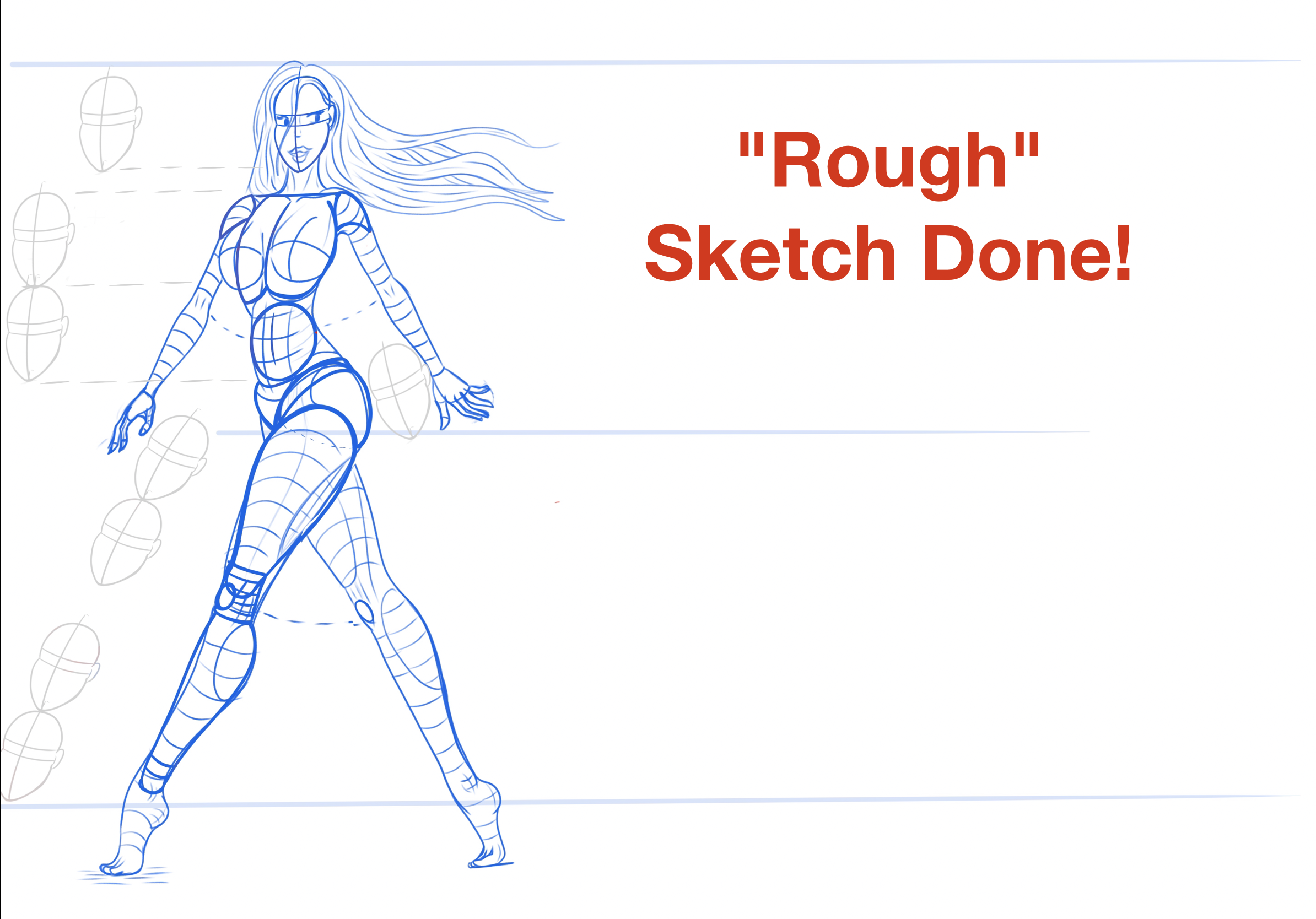
Remember that I penciled that out about five separate times trying different poses and angles, then inked the good one on paper, before moving to digital for a few more passes, before getting to what you see above, typically.
After taking a phone pic and setting the paper drawing as a background in my Procreate project, I usually use a 0% stabilized ‘pencil’ brush in Procreate to sketch it again (blue), then a 50% stabilized ink brush to do the first passover (red), and then a 70% stabilized ink brush (black) to do the final inking:

Here’s a zoomed in version to see the difference in the brushes:


If you’re just starting in digital art like I was a year ago, brushes will be the most confusing first thing.
There are a thousand brushes out there for every program, some artists even sell you digital ‘packs’ of brushes they use, some give them away for free. And under every brush there are a million confusing settings you don’t have time to figure out.
In my experience you can mostly use the default brushes that come with your system, as long as you find that one stabilization setting, shown in the picture above. If you’re drawing curves that should be smooth when done by your hand on paper but there are little tiny ‘wobbles’ showing up in the digital line when you draw it, that’s your problem, turn the stabilization up.
I would say starting out inking, you only need two brushes: a rough one to sketch and one smoother one to ink. You can see above there’s not a huge difference between 50% and 70% stabilized, but for the long continuous line most pin-ups have from their hip down to their toes, for example, I like using the 70% smoothed over 50%, to give a cleaner smoother line:

Everything we do in the previous two steps is building to making that long smooth unbroken line in the final ink. Here’s what I’m thinking about in each step of the process:

When you get to the final inking there should be NO DECISIONS to be made there- you’re just zenning out listening to a 5 hour mix of Lo-Fi girl on Youtube and following a good line you’ve already planned, working on making the start and end of it smooth.
All the big decisions were made in the redlining step, even what direction you’re going to hold the iPad to make the stroke (don’t be afraid to turn it upside down, most people stroke best one way!)
One of the biggest mistakes I used to make was trying to decide little things how a deltoid would merge into the shoulder bone in my black ink step, or how the fingers would be posed. Indecisiveness leads to bad lines. The reason we do things multiple times is so that by the final ink step, we can focus on nothing but how the line starts and ends.
That’s the process that works for me, anyway.
Here’s an example of the lines I’m trying to avoid and make in that final step:


Those line overlaps happen when you’re starting and stopping matching lines, so try to avoid that in areas like the knees, the narrow waist, the elbows. Everyone finds their own path, but it’s really neat discovering which lines connect to what on the human body, and what you can draw in one long unbroken line and what you have to break up because of size or hand limitations.
(For example, I finally noticed that the collar bone arcs up and into the top of the shoulder (delt) in one nice line, and that the end of the calf muscle isn’t the heel, but the ankle! Felt like an anatomical scientist figuring that out, you’ll find your own set of standards!)
Also notice what’s MISSING from the last ink drawing, versus the red or blue.
The collar bone for example, the belly lines, the outline of the breasts, and I should have gotten rid of those neck tendon lines as well. Sharp black lines are for HARD CORNERS or volumes that are SEPARATE from a far away background (the outline of the body), not for internal softer rounder edges, like the collar bones or the edge of breasts. Those are best done in a fuzzy brush during shading, not here, or your pin-up will look like she has sharp 90 degree corners for collar bones. Took me a long time to learn that. (And I still didn’t get it right- look at the neck tendons I left in above.)
Now, once you’ve got a nice WATERTIGHT black ink outline, you can move on to:
Step 2: Flat Colors
Most digital programs do this super easy, just drag and drop your base skin color into your ‘Reference’ ink layer in Procreate and you get to here:

God help you if you have even a ONE PIXEL gap in your outer black line, because then the fill color will spill EVERYWHERE on your canvas. This is hella annoying and happens to even good artists (always check the hair and fingers and toes, that’s where I see gaps the most often), and it makes me so mad I’m not even going to talk about it. Spam ‘F’ in the comments if you agree.
I want to talk about something much more important: you’re going to hate how your art looks at this stage.
It happens to me every time, my feelings about a piece go up and down like a drunken roller coaster, so much so that I even made a graph to show you:

Starting out your pencil sketch will be rough but it has POTENTIAL so you probably feel okay.
Then you do a pretty good digital sketch and it looks so clean and sharp against a bright digital screen (I love more contrast than paper can give) and you’ve got really good cross contours showing the ROUNDNESS of your form and you feel pretty good. I do anyway.
But THEN you remove all those cross-contours to do your final inking (remember what I said about sharp collar bones above, all those interior lines need to be removed unless you’re drawing a sharp metal sex android) and suddenly your work looks empty. Silly. Cartoonish. Bloby. You’re in the Trough shown above.
You never realize how much realism the illusion of depth is adding to your piece until you remove it, and it has to stay removed for 2 steps, so this is my lowest point. I usually hate the piece right here, maybe you are different. Push forward either way.
BUT THEN you start adding back that illusion of depth with SHADING and HIGHLIGHTS (the very next section) and you feel GREAT about the piece again! It looks REAL and FUN and SEXY. So keep going!
Adding clothes and hair and shading on the clothes is still a high point, I’m really proud to show the work off at this point BUT THEN-
-you’re going to really HATE your work JUST before you post it or put it up for sale or whatever. You’re going to second guess every decision you’ve made. You’re going to try ‘fixing’ how her fingers look and you’re going to mess it up and you’re going to feel like just deleting everything. (Writing this blog immediately after I’ve finished this drawing but before I’ve posted it, I’m feeling all of this RIGHT NOW.)
Steven Pressman in his ground-shaking book “The War of Art” calls this ‘The Resistance’- the horrible deadly demotivating force every artist feels, the evil entity in your head trying to keep you from releasing good work. Even world class artists feel this (Pressman still does), and the more important the work to you emotionally, the stronger The Resistance.
That little voice telling you to go back and change one more thing. To wait just a little, while you scroll Instagram. That it’s not good enough. That it’s too controversial. Too bland.
I’m not an expert in overcoming The Resistance, but Pressman is, so I recommend you read his book. But the only thing I can say is who gives a fuck. Release your work and keep going. If you see errors, do better on the next one. This piece will not be the one that stops your art career. Keep repeating that.
For example, right now, as of writing this, I haven’t put the finished version of this pin-up sticker up on my shop. After all the fuss I made last blog about staying on the Frank Cho end of the spectrum, now I’m looking at this finished drawing’s thin wrists and legs and screaming “What did I DO?! Why didn’t I make her THICKER?! She’s A STICK FIGURE! THIS ISN’T WHAT I WANTED!”
But this piece won’t be the one that stops me. I’ll do better next time. And having the work out in the world is better than not. If even ONE person looks at my work and feels a little happier for a second, then it’s a net gain over doing nothing. Release the work and move on to a better one.
(Hopefully I’ll overcome the resistance and have the stickers up by the time this blog is released.)
Now let’s move on to the most FUN part of digital art, where you see the POWER of the medium and feel the BEST about your work:
STEP 3: SHADING and HIGHLIGHTS
For this you’re going to need a new brush. Different programs call it different things, but you’re looking for one with a soft airbrush-type edge, one that FADES OUT with some fuzziness and transparency from center to edge. With our current laws of physics, that’s the only way to make things look ROUND, and most pin-ups have a lot of ROUND PARTS, so you’re going to use this brush a lot.
Here’s the one I use in Procreate:

The way you use that soft brush is by taking a color that is darker AND more saturated than your base color, and coloring the areas of your legs, arms, and torso that AREN’T facing your light source. Like this:

Lots to unpack there.
First, the color. If you only make your shading color darker (only move it down towards the black part of the color wheel) then your shading looks muddy. Try it. Try shading your model with only black. Looks crappy, doesn’t it?
So I watched a smart person’s Youtube video about this, if I ever find it again I’ll link it here, but she told us to use not just a darker color (down white arrow) but a MORE SATURATED color when shading, to make it look realistic. Which is why my shading color above looks very orange.
It would be weird if a person’s whole skin was that orange, but if you look at high quality pictures of girls in bikinis (you know where to get them), that’s the color of their skin that’s not facing a light source. Now look at that image again:

Picture that thing we’re shading as a cylinder.
Human thighs are basically cylinders. Human arms are basically cylinders. Torsos? Cylinders. Head? Sort of a cylinder. So you’re going to have a lot of chances to do this kind of shading. Just put the more saturated color on the sides of the cylinder NOT facing the light.
Finally, the fuzzy brush goes everywhere, like a messy can of spray paint. And the bigger you make the brush (for a softer rounder thigh result), the bigger the mess. So you need to do something to ‘contain’ the fuzz where it goes outside your flats.
So I’m not painting on the Flat Color layer above. I’ve made a separate layer ABOVE the Flats, and Layer B can ONLY have pixels on it, where it overlaps the flat layer. Every digital painting app calls this something different, in Procreate it’s called a “Clipping Mask”:

So the first thing I do for shading is go around and fuzzy brush all the sides of every body cylinder not facing our main light source with a more saturated color, usually something orange.
After that, we do the opposite: I put WHITE streaks on every part of the cylinder that DOES face the light. To be consistent with what I told you above, I should be using a less saturated skin color like some pale yellow but fuck it YOLO, rules are for losers, and I’ve found pure white looks best. I can’t show them for copyright reasons, but if you look at any Sports Illustrated Swimsuit Model, they have a similar white streak on their thigh usually, where the lucky spotlight guy is pointing his thingy:

She’s starting to look pretty good!
(If you remember from our chart above, this is when you should start feeling the best about your work!)
Obviously I’m glossing over a lot of brush strokes here, but they’re all the same: Saturated shading on the non-light sides, white highlights on the light sides. Change the brush size and repeat. Do you want to see a shading and highlight tutorial all by itself, where I go over every step? Write your vote on the inside of a fish and let it go in the deep blue ocean, and I’ll know.
If you’re just starting out, start with the big muscles only, shading the edges and white lighting the middle. As you learn the names of more and more muscle groups, your drawings will get more detailed and fun as your resolution increases! This is when making the art becomes the most fun, because you’re literally making your pin-up come off the page, by shading her appropriately to look 3D! Like, look at these:

It’s all cylinders, all the way down. So just decide what level of cylinder you’re going to include in your pin up!
A lot of the early art I see on DeviantArt is missing this step, but shading and highlights do so much to make your art look 3D, so definitely include it.. I don’t know if I’m talking too much or too little about this. Let me know.
One last thing that blew my mind: if you go into any museum you’ll see a whole bunch of highly-detailed paintings about grapes and peaches and you’ll wonder why they spent the time, when people were dying of the Plague. Old timey artists didn’t care so much about grapes (well some did, the pervs), but because, if you can shade and highlight a grape, you can shade and highlight a butt:

And it’s probably easier to get a bunch of grapes to sit still for you for 4 hours than a naked lady, especially in Medival times.
I used to hate still-life paintings, but now that I understand what they were REALLY painting with all those grapes and peaches, I actually do some myself, to get better at this most critical step.
Okay, now we can move on to:
Step 4: Clothes and Hair
It’s a little known fact that all pin-up girls are naked underneath their clothes.
Now that we’ve drawn her naked, let’s put some clothes and shoes on our classy girl to complete the look!
This follows the same process as before: rough sketch, inking, flats and then shading and highlights, so I won’t go into all that, but just realize that most clothes AREN’T cylinders, they’re drape-y stretchy napkin-like things and so I hate them.
You’ve spent SO MUCH time figure drawing to get good at cylinders, and now you have to draw their exact opposite! Especially shoes. GOD I hate drawing shoes- half my models are barefoot just because drawing shoes is so annoying.
Just like with the grapes above, if your models are going to be more clothed than not, you’ll have to do a lot of studies on how to render folds and twists in cloth, and different surfaces like shiny rubber or soft velvet look with your limited colors. Pinterest is great for this, and you’ll be doing a lot of this:

Developing a ‘recipe’ for how you render denim vs. velvet vs. latex is the secret sauce of most good digital artists, so write that shit down once you figure it out for each material and then share it freely and widely, so we can all have better art to look at. If you want tutorials on that, write it on a $20 bill and… you know what to do.
You’ll also notice I haven’t colored the flats for her hair yet. That’s because I’ve found if you do the hair the same time you do her face, when you’re shading and highlighting the face, the spray can of colors gets in her hair and muddies everything up. Better to keep them on separate layers, to keep things contained. So I put the hair with the clothes. Try it yourself, it should help your workflow.
Anyway, after you sketch and ink and flat color the clothes it should look like this on the left:

And then we follow our same cylinder rules to get to the right. You can see how much of a difference that makes.
And YES FINE I’ll draw some shoes even though they suck but there’s something else this girl is missing-
EYEBROWS.
WHY DIDN’T ANY OF YOU TELL ME SHE WAS MISSING HER EYEBROWS:

It’s good to create a little checklist to go through at this stage, to make sure you don’t miss any important details like EYEBROWS holy shit.
On my checklist is finger and toe nail polish, hair shading, and small light fuzzy shadows to ‘ground’ the model on what ever she’s sitting or standing on. I never used to do shadows (I like my ‘white space’) but they really do ground things in 3D space. You want to feel like your pin-up model is interacting with the sofa or chair or bomb she’s sitting on, and this shadow helps.
One last thing to add to your final checklist: consider using photo editing tools to up the SATURATION of your picture before release. I didn’t do this for months, didn’t even think about doing it, but once I did, now I can’t go back. I mean, look at this:

This is not an optical illusion. The image on the left is the one in all the previous examples (except for the header image of this blog post) and up until now, it’s looked perfectly fine!
But now that you see it side by side with an up-saturated image, we can’t go back! Just look at her HAIR on the right, it’s so much more ALIVE, right?
You do lose some shading details on the dress that get washed out at higher saturations, but remember how I said I second-guess every one of my decisions at this stage, and this is a big one.
If you even go back up one picture to where I added her shoes, just looking at the original and letting your eyes adjust for a bit, she looks pretty okay, right?
But then you go down to the side by side and the saturated image blows the original away.
I don’t know what the fix for this is, why I can’t just paint in the more saturated colors from the start, but once I started doing this my pin-ups have just come more alive off the page, hopefully it will help you too. Just try it once, if your pin-up isn’t ‘popping’ enough.
Now do EVERYTHING we’ve done up until now one more time for the boys in the background and you end up with this:

Everything I’ve done there we’ve already talked about, just now smaller and in the background, so all I will say about the background is that, yes, I did try to make the trains look like to male members smooshing together because that’s funny to me and on theme with the irony and if you can’t have silly fun drawing pin-up girls, go off and draw grapes or something.
Wet… oily… smackable grapes- what were we saying? Oh yeah, take that image and add some text and you’re done!

Final Thots
We’ve covered a lot here.
Hopefully you haven’t gotten bored looking at my one piece over and over.
Hopefully it’s helped you to make your own fun, sassy, sexy pin-up, and if it has, post a link in the comments and we can feature or review it!
My original goal with The Lazy Pencil was to make around $200/month selling stickers and commissions and maybe going to art shows and conventions, but if we just create a community of new pin-up artists who help each other out, that’s good too. I’m not really planning on starting a YouTube channel or selling online classes or anything, but if you’d like to consume this content some other way than reading, let me know, we’re all still figuring things out.
Hope this helped get you started, and leave suggestions for what you’d like to see in the future!