How To Shade Sexy Female Muscles and Make Them SQUISH

So you want to draw boobs. And butts. And long sleek female legs and stomachs and you want them to look SOFT and ALIVE- so how do you DO all that?
It all comes down to two rules:
Soft things deform around hard things.
Many passes of a weak shading brush are better than one pass of an aggressive shading brush.
Let’s use these rules as we go through our normal pin-up process (as outlined in my first blog post) to try and make the work above!
Step 1: Inspiration
The inspiration for this piece was that there are a lot sexy streamers on a platform called Twitch, and that sometimes, human beings twitch when they are being sexually stimulated. That’s it. It’s a bad pun. But it made me chuckle once, so here we are.
But on a deeper level, I posted my ‘girl causes train crash’ piece on DeviantArt, and one commenter said he didn’t like the shading. I asked him why and he said there was another artist called “ArtzyBasheff” who did muscle shading much better. And goddamnit he was right:

You can see ArtzyBasheff has MUCH more control over his transition from light to dark areas, using more shades and making shapes I never bothered with, and defines a LOT more muscles at a smaller level than I did. He’s basically working at a much higher resolution than I am.
And I thought I had everything figured out.
But looking at Artzy’s work I felt like an amateur, a fraud, like I was doing child’s play. So I pulled up my sleeves and started to learn.
(If you’re okay with nudes, check Artzy’s great work out here: https://www.deviantart.com/artzybasheff )
Here’s my first attempt to break down his style with my own brushes (I will show you how in step 3):
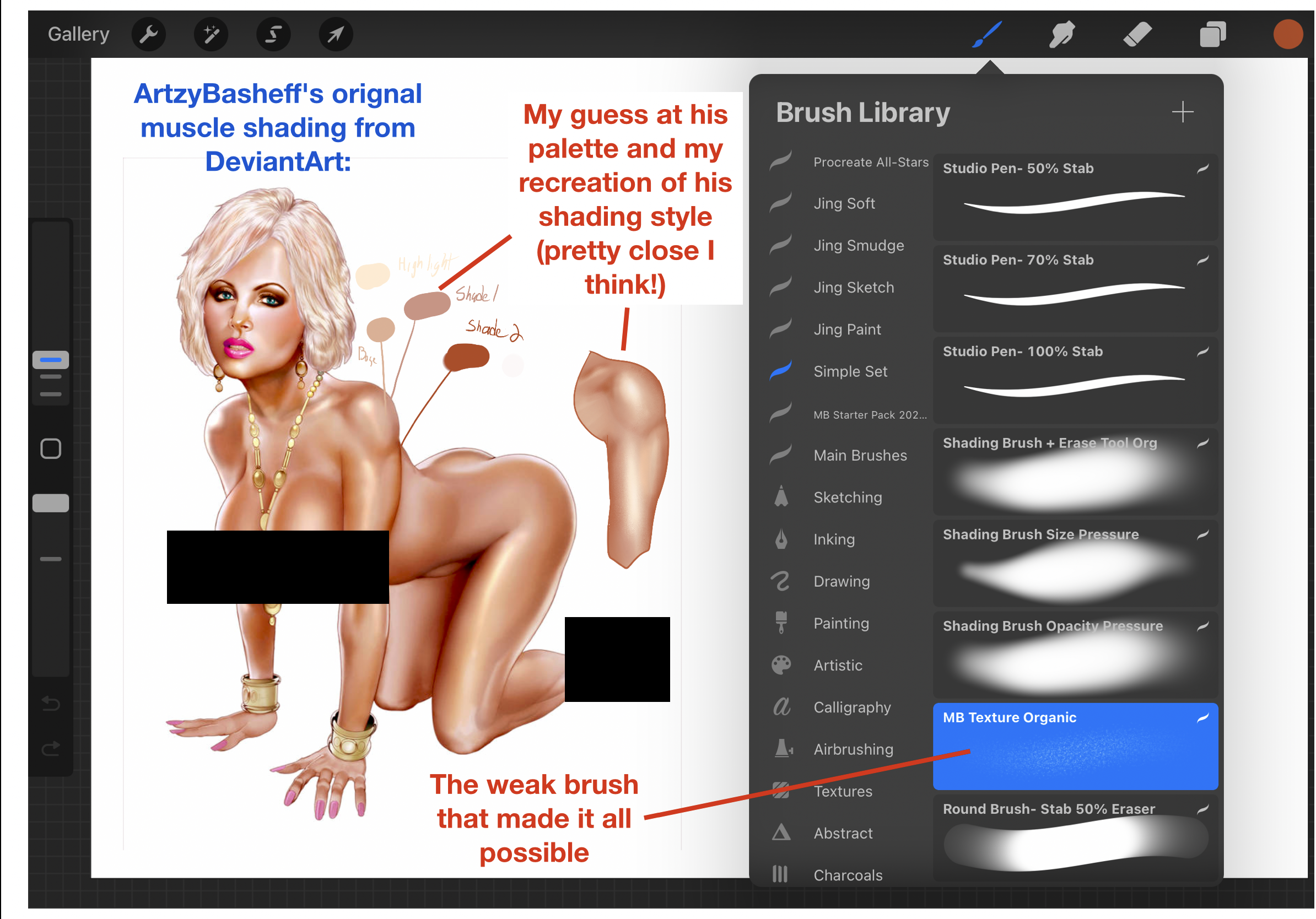
Because I got pretty close with that arm on the first try, I was REALLY inspired to make a whole image that way, now that I KNEW it was going to look better than how I had shaded before! If you’re still learning, I recommend trying this with your favorite artist: take a piece of theirs and try to recreate just the shoulder, or thigh, or if you’re feeling daring, a foot.
Don’t do the whole body, that’s way too many decisions to make- just try doing ONE shaded body part, just to see how close you can get. You’ll learn something, guaranteed, and probably be really inspired to draw too!
A final bit of inspiration- my previous piece showed a girl standing, from head to toe. If I wanted to ‘increase my resolution’ on her muscles, to ‘zoom in’ so you can see that little curve the breast/pec makes when meeting the shoulder, etc., I needed to bend her somehow. Can’t show her standing head to toe AND zoom in AND keep my paper size the same all at the same time. So I went with a kneeling gamer girl, with something fun yet undetermined between her legs to make her twitch.
And that was our inspiration: a dumb pun, a goal to render muscles much more beautifully in an ArtzyBasheff style, and that she would be kneeling, not standing, so we could make her wider on the page. Let’s start sketching.
Step 2: Rough Sketching to Ink Outline
As we talked about in my first blog post, thank god I didn’t stop after my first rough sketch:

I don’t even know what was happening with that first head, I think I tried to give her glasses and that screwed up the head proportions relative to everything else. Never give up, never surrender after your first sketch, I guess.
This is also the stage when you have to apply the first of our big rules:
Soft things deform around hard things.
It may seem obvious but how many times have you seen butts in pin-ups drawn like this:

For me, it really helps if I draw the UNsquished shape first (in red above), and then try to imagine where the missing mass might spill over into when pushed. It doesn’t have to be 1:1, but that pushed-around mass should deform the rest of the shape at least a little.
Here’s another one I see a lot:
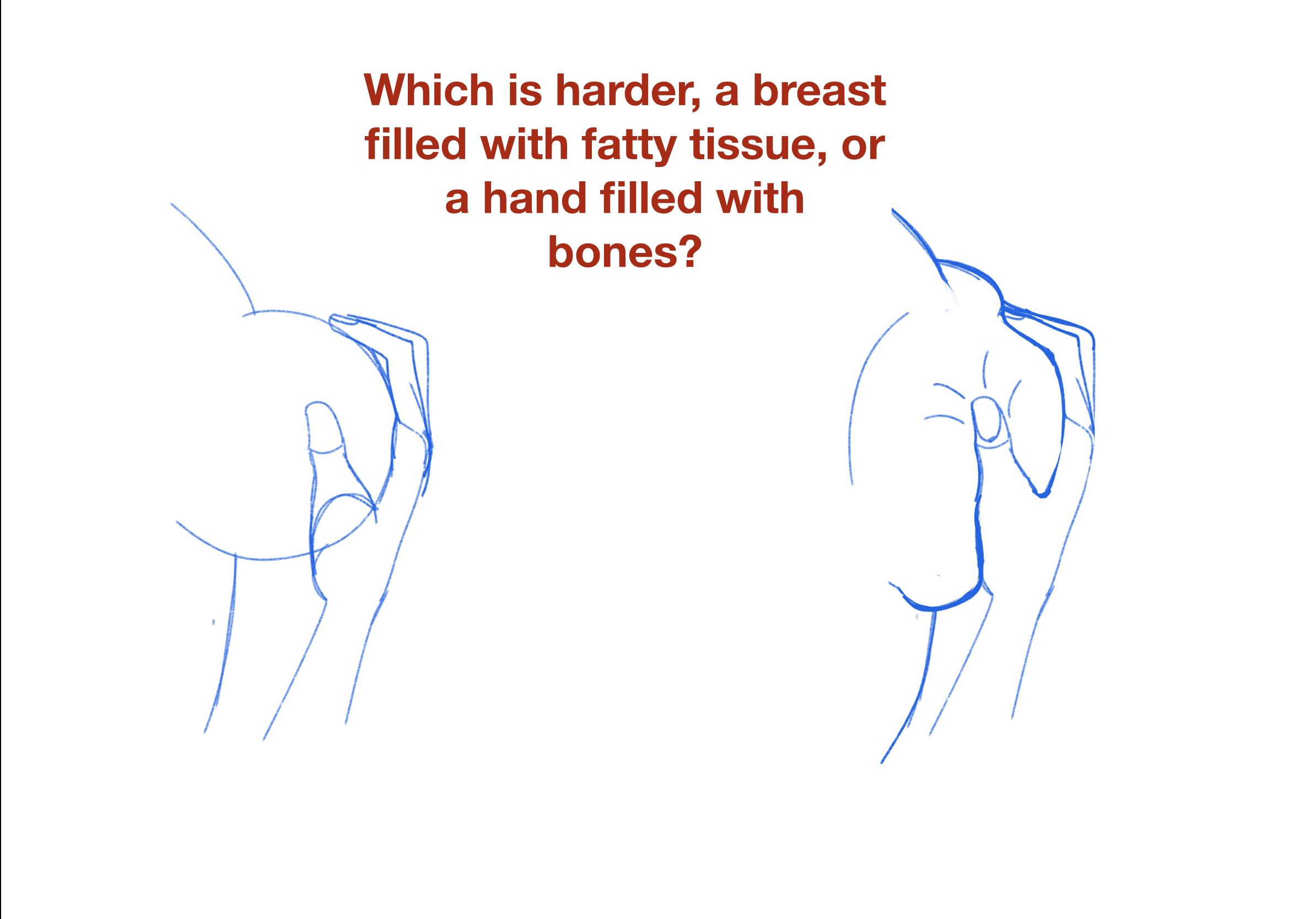
It’s obvious WHY this happens, right?
People want to draw sexy women. And of course sexy women have PERFECTLY ROUND and PERFECTLY SYMMETRICAL breasts and butts, and anything that disrupts that roundness sometimes gets rejected by beginners.
But to make women look SOFT and ALIVE, and not robotic, we’ve got to embrace the imperfections, to allow spherical shapes to deform around the environment (and even clothes!). I first learned this from the great $10 book “Learn To Draw Women” by Alvaro Muñoz (i.e. the artist “CoaxDreams”) found here: https://coaxdreams.artstation.com/store

Muñoz explains it a lot better than I do, like with the water balloon picture above. If you’re serious about being a pin-up artist, that book is probably the best $10 you’ll ever spend. Very easy to understand, with lots of practical tips on drawing sexy women you won’t find anywhere else. And lots of pictures.
So how does this help us? We have two main areas of squish in our pose: in her thighs around the joystick and on her breasts against her biceps:
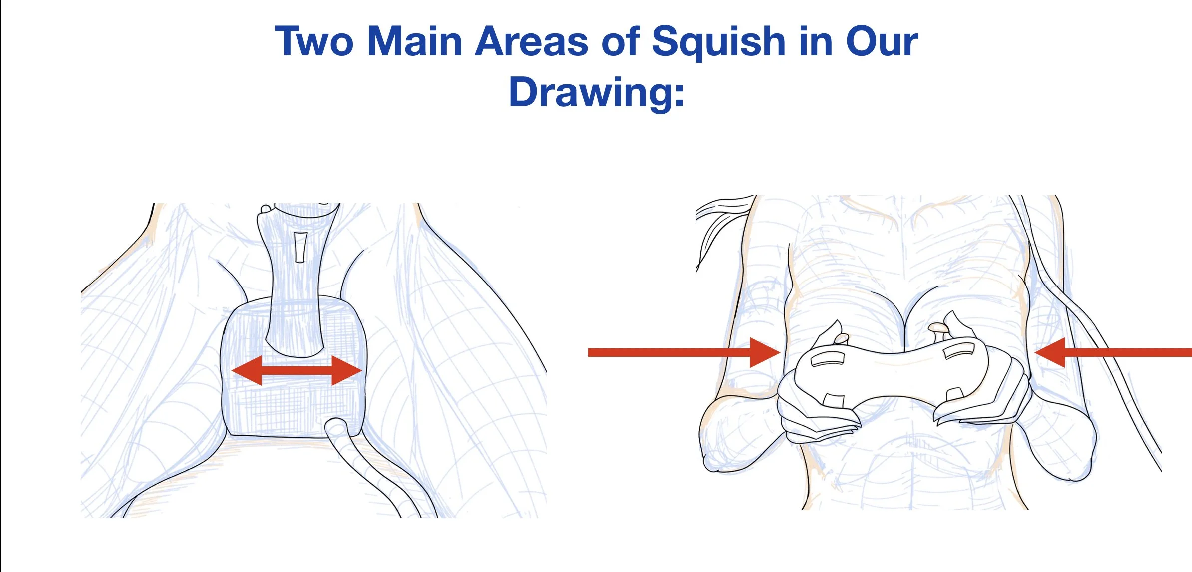
Try to picture the outlines of each non-squished area in your head first.
To be fair, I could have ‘pushed’ each set of lines more, to make the squish even more obvious for this blog (imagine the softer half becoming even more deflated, like a balloon losing air), but at a certain point it starts to look gross, like her skin is melting.
That’s actually a good exercise to do- take your favorite body part and draw it with three to five increasing ‘levels of squish’ against a hard thing, until you figure out where your preferred line is. Where it looks enticingly soft but not saggy. I had to do this with boobs and water balloons, like Muñoz suggests above, until I found my own style.
And even then it took me like TEN tries to get the soft boobs against her hard biceps to look right up there!
Her inner thighs around the Thrustmaster 9000 were a lot easier for some reason- and yes, the best gaming joysticks for high-end flight simulators in the world are called “Thrustmasters” please please google it because I laughed so hard when I found out researching this piece.
But the point is you have to bend the curves HERE, in the sketching stage, because after this point your lines are set. After this, to show squish, the only thing we have control over is the shading, which is the next section.
Any questions? I’m always listening at thelazypencil69@gmail.com, or you can carve your query into a grain of rice and throw it into the storm-tossed ocean. Either way it will reach me.
Next section.
Step 3: How to Shade Muscles at a Higher Resolution (by using weaker brushes)
So I use Procreate for digital art and Procreate comes with a default set of brushes. I’ve already talked sketching pencil vs. line art pen brushes in my last post, and I mentioned I was using a ‘fuzzy’ brush for shading, one that’s not defined by a sharp precise line at the edges, but some drop-off from the center, which creates the optical illusion of a cylinder bending away from the light to our simple animal eyes:

I do both the darker shading at the edges and the white highlights in the center with this brush.
Or at least I used to.
For the last year plus as I’ve been learning, I used this default brush as my only shading tool:

And you can see there is SOME drop-off from the center, but the problem was, when you make the size of that brush very small (like for shading a collarbone for example), the drop-off gets so small it’s basically a sharp solid line, and that’s not great for gentle shading, for obvious reasons:

You can see above that at 6% brush size I get some decent fuzzy falloff, but at 3% we’ve totally lost it. At 1% you might as well be using an ice pick to draw.
So if I wanted to shade that delicate collarbone, what size brush would I use? 6%? 3%? 1%? If you’ve used Procreate before you recognize my brush size ‘snaps’ in the left hand column above, and there’s barely any room to get another size in there- and I’ve tried!
Even using 3% size and making it 50% transparent and going VERY gentle with the pressure didn’t get me the delicate touch I needed to make that collarbone in an Artzy Basheff style. The line was too sharp.
So let’s make the shading brush weaker, like this:

You can see how that will eventually become her soft rounded collarbone after many many delicate passes.
It takes a lot more time, which sucks because there are so many YouTube shorts to watch nowadays, but you can see how I can now build up the Artzy-Basheff-style muscle control one pass at a time, whereas things would just get blasted with color before. It takes a much more time, but I think it’s worth it.
I got this weaker Procreate brush from the great art Youtuber Marc Brunet, who teaches a ‘Youtube Art School’ here: https://youtube.com/@YTartschool?si=0_IvqyK5bZkxgaPa
After watching him for a long time I was convinced to go to his CubeBrush shop and buy some of his Procreate brushes, which I was happy to see were FREE! The ‘organic brush’ was in this starter pack: http://cbr.sh/i3ozi
That is a MUCH weaker and softer brush than my normal fuzzy airbrush tool, and you can really see the ‘speckle’ effect of the brush on the girl’s shoulder and pec, which sometimes looks weird up close but looks REALLY GOOD and organic when viewed as a whole piece:

Marc’s a treasure of the Youtube art teaching community, so give him a lick and a sub if you want to get better at drawing humans. Ooops, I meant to say a ‘like’ and a sub- OR DID I?
Two More Steps I ‘Forgot’ To Mention
I didn’t mention these above because I wanted to trick you into thinking this tutorial was short and easy instead of long and hard (heh). But there are two other things we need:
3. To render muscles at a higher resolution we need to KNOW the muscles at a higher resolution
4. To render bodies at a higher resolution we need to understand how LIGHTING affects the smaller muscles we now know the names of.
For example, look at her neck above- see those two ‘V’ shaped lines converging on her collarbones? If you don’t put those lines in your pinup, her neck will look very thick and cylindrical instead of slender and elegant. Pop Quiz Hotshot: what are those two neck thingys CALLED?
If you said ‘sternocleidomastoid muscles’ you’re a lying liar and googled them just like I just did.
But it’s enough to know that you need two ‘sterno-something-somethings’ on your pinup’s neck to make it look slender, even having just a partial name reminds you to put them in!
Same for that slight sexy line that runs down a woman’s inner thigh to make it look defined (the ‘sartorious’) and tens of other little anatomy things. I bought one of those laminated medical student charts to learn the Latin names for things, and I apply CONTOURS at my sketch stage to define the 3D shapes of them:

I refer back to those blue contour lines a LOT while shading, to figure out how the light will fall on that cylinder (every muscle is a cylinder in the end).
And they really make my rough blue sketch look nice and 3D, so I can’t believe I went MONTHS without adding them in! You should start adding those cross contours if you’re not already.
Notice for my quads I’ve got the converging lines where the muscle attaches up to the corner of the hip, that’s the level Artzy Basheff is working at and beyond, and what we should strive to define during shading. If we don’t get too impatient.
If you REALLY want to learn the names of all those little muscles to draw them like superheros, I recommend the book “Drawing Cutting Edge Anatomy” by Christopher Hart here: https://www.amazon.com/Drawing-Cutting-Edge-Anatomy-Reference/dp/0823023982

That’s where I learned muscle names like the Sartorious and the Sterno-whatever-whatevers mentioned above. Hart focuses a lot on beefy comic book men, but about 1/3rd of the book is sexy comic book women. And when he defines a muscle, Hart REALLY defines that muscle, sort of a super Artzy Basheff, so definitely recommended.
After you KNOW the names of all the muscles you want to highlight, now you’ll need to know how light falls around all those little cylinders you’ve cross contoured in blue.
If you’re doing things right in the Inspiration stage, you’re inventing poses that haven’t really been seen before. There might be something CLOSE, but you don’t want to just copy some picture you’ve seen and call it a pin-up. For my pose above, there were a lot of reference pictures I found of:
Girls on their knees
Girls holding controllers
Girls with ‘thrustmasters’ between their thighs
Girls naked
Girls staring at a bright computer screen in a dark room
Girls with a shocked but also slightly turned on face
But not one reference of ALL those things happening at once.
It was particularly hard to find references of naked girls in just that pose just covering their bits with gaming equipment with just one bright light source in front of them. That’s how you know you’re drawing something original, when Google Images comes up dry.
So I use a cheap app called ‘Magic Poser’ which lets you put a default female body in any pose you want and move the lighting around her, to get a sense of what those cylinders are really doing. Here is what my Magic Poser looked like:

Magic Poser is great for letting you swivel that light all around your body to see what falls into shadow or highlight. You can also pose every SINGLE joint separately which sometimes sucks because the mannequins ragdoll a lot when you’re trying to adjust her wrist and her whole shoulder moves.
It’s great for lighting, annoying for posing, but if you’re serious about being a pin-up artist, it’s not the worst $10/yr you can spend.
Specifically, it helped me get her knees looking right on this piece, I drew them as two balls instead of the tube knee I normally do. And the shading on her… bloopy side knee muscles? I don’t know what they’re called, I should probably learn more anatomy.
Let’s finish this thing.
FINISHING THIS THING
As I mentioned in my last post, after doing the shading and putting in backgrounds and you’re 99% done is when you will feel the WORST about your work, where you’ll second guess every decision you’ve made up until now. You just have to push through The Resistance and publish it, haters be damned.
In my case I couldn’t figure out if I should have speed lines radiating from her ‘center’ or not, or the halo, I literally added and removed them both 10 times, you’ll have to tell me which looks better:

That’s the type of silly dithering you’re going to do at this stage, it’s just The Resistance trying to keep you from releasing your creative work into the world- push through no matter what.
You can see in this blog header I used the halo but not the speed lines, through writing this article I actually came to hate them both I think, so the final piece up for sale on my Shop ($5 stickers if you want them!) looks like this:

I STILL don’t know if I made the right decision- but it’s out in the world and that’s the goal, and we’ll try to do better next time.
Overall, I’m very happy with how much better the muscles came out versus the level I used to be. We still have a long way to go to reach Artzy Basheff levels, but at least I can see the path there! Now it’s just learning the names of smaller muscles and taking enough time to render them, and not running out of patience near the end.
I’ve got the brushes and the theory, and hopefully now you do too- so go draw something great, and let me know what you want to learn about next!